# jordium-gantt-vue3 logo jordium-gantt-vue3

npm version npm total MIT License Vue.js TypeScript Nodejs

中文 | English | Release Notes

A modern Vue 3 Gantt chart component library providing complete solutions for project management and task scheduling

📱 Gitee Live Demo   |   📱 Github Live Demo   |   📦 GitHub   |   📚 npm

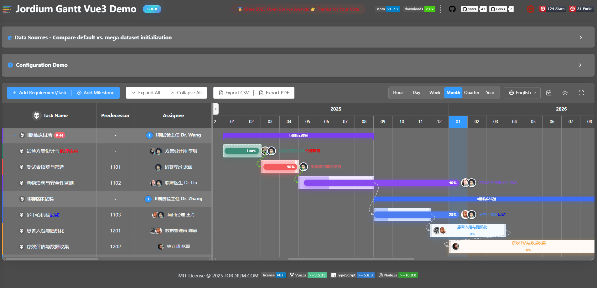
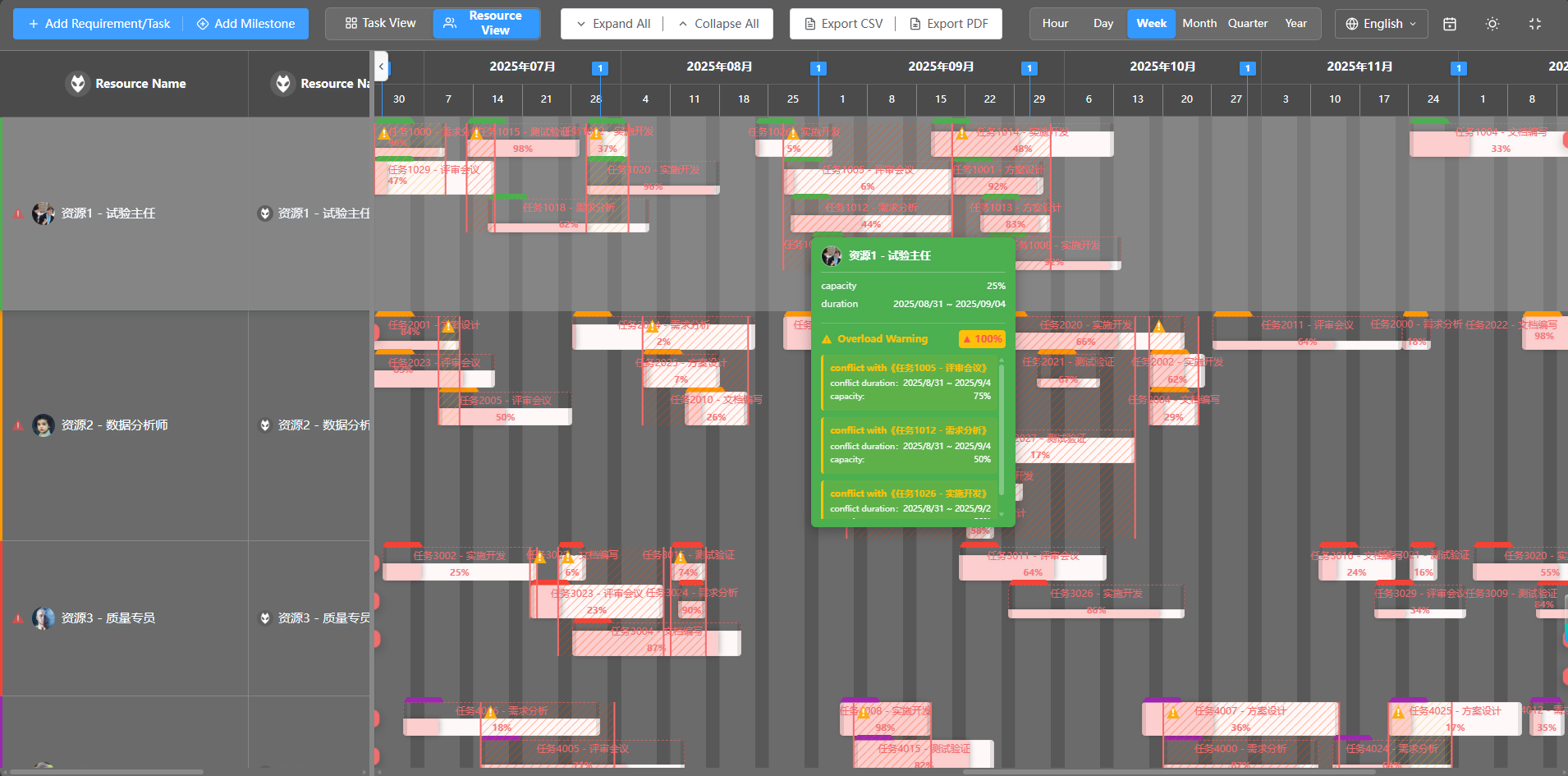
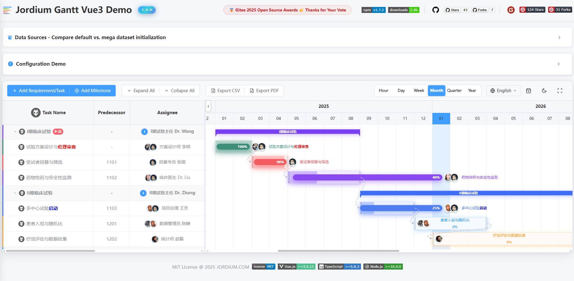
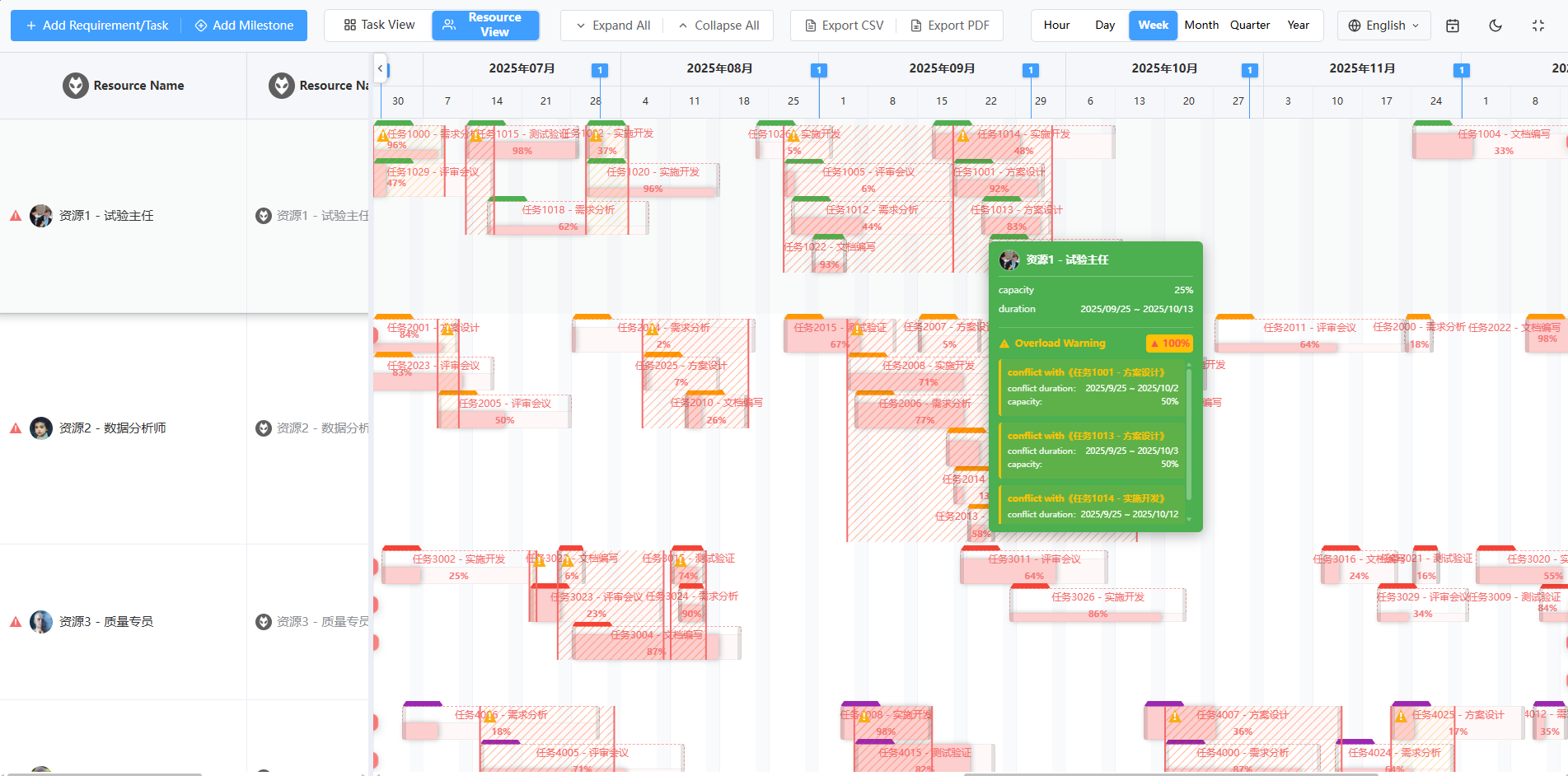
--- ## ✨ Introduction jordium-gantt-vue3 is a modern Gantt chart component built with Vue 3 and TypeScript, designed specifically for project management and task scheduling scenarios. It provides rich interactive features, flexible configuration options, and elegant visual effects. ### Core Features - 📊 **Feature Complete** - Task management, milestones, dependencies, progress tracking - 🎨 **Theme System** - Built-in light/dark themes with customizable styles - 🖱️ **Smooth Interaction** - Drag & resize, zoom, double-click edit, context menu - 🌍 **Internationalization** - Built-in Chinese/English with extensible language support - ⚡ **High Performance** - Virtual scrolling, lazy loading for handling massive data - 💎 **Type Safe** - Full TypeScript support ### Preview #### Light Theme Light Theme Light Theme #### Dark Theme Dark Theme Dark Theme --- ## 📦 Installation Install using your preferred package manager: ```bash # npm npm install jordium-gantt-vue3 # yarn yarn add jordium-gantt-vue3 # pnpm pnpm add jordium-gantt-vue3 ``` --- ## 🚀 Quick Start ### Import Component Import the `GanttChart` component and styles: ```vue ``` > **Tip**: The style file only needs to be imported once in your project. It's recommended to import it in `main.ts` or the root component. ### First Example Create your first Gantt chart: ```vue ``` 🎯 **[Try Live Demo on Github →](https://nelson820125.github.io/jordium-gantt-vue3/)** Recommended: DOVE VPN for fast and stable access. (Note: Please use VPN services legally) ## 🌞 NPM Package Usage Example Please refer to the npm-demo folder in the project. It is a standalone project that can be opened and run independently using your IDE. Before running, make sure to install the Element Plus library and the jordium-gantt-vue3 plugin package. ```bash # npm npm install element-plus npm install jordium-gantt-vue3 npm run dev ``` --- ## 📖 Component Guide ### GanttChart Component `GanttChart` is the core entry point of the library, providing complete Gantt chart functionality. #### Basic Props | Prop | Type | Default | Description | | --------------------------- | --------- | ------- | ------------------------------------------------------------------------- | | `tasks` | `Task[]` | `[]` | Array of task data | | `milestones` | `Task[]` | `[]` | Array of milestone data (Note: Type is Task[], must set type='milestone') | | `resources` ![v1.9.0](https://img.shields.io/badge/v1.9.0-409EFF?style=flat-square&labelColor=ECF5FF) | `Resource[]` | `[]` | Array of resource data (used in resource planning view) | | `viewMode` ![v1.9.0](https://img.shields.io/badge/v1.9.0-409EFF?style=flat-square&labelColor=ECF5FF) | `'task' \| 'resource'` | `'task'` | View mode: 'task' for task planning view \| 'resource' for resource planning view | | `showToolbar` | `boolean` | `true` | Whether to show the toolbar | | `useDefaultDrawer` | `boolean` | `true` | Whether to use the built-in task edit drawer (TaskDrawer) | | `useDefaultMilestoneDialog` | `boolean` | `true` | Whether to use the built-in milestone edit dialog (MilestoneDialog) | | `autoSortByStartDate` | `boolean` | `false` | Whether to automatically sort tasks by start date | | `allowDragAndResize` | `boolean` | `true` | Whether to allow dragging and resizing tasks/milestones | | `enableTaskRowMove` | `boolean` | `false` | Whether to allow dragging and dropping TaskRow | | `enableTaskListContextMenu` | `boolean` | `true` | Whether to enable TaskList (TaskRow) context menu. When `true`: uses built-in menu if `task-list-context-menu` slot is not declared, uses custom menu if slot is declared; when `false`: context menu is completely disabled | | `enableTaskBarContextMenu` | `boolean` | `true` | Whether to enable TaskBar context menu. When `true`: uses built-in menu if `task-bar-context-menu` slot is not declared, uses custom menu if slot is declared; when `false`: context menu is completely disabled | | `assigneeOptions` | `Array<{ key?: string \| number; value: string \| number; label: string }>` | `[]` | Assignee dropdown options in task edit drawer | | `locale` ![v1.7.1](https://img.shields.io/badge/v1.7.1-409EFF?style=flat-square&labelColor=ECF5FF) | `'zh-CN' \| 'en-US'` | `'zh-CN'` | Language setting (reactive). Component's internal language will follow changes | | `theme` ![v1.7.1](https://img.shields.io/badge/v1.7.1-409EFF?style=flat-square&labelColor=ECF5FF) | `'light' \| 'dark'` | `'light'` | Theme mode (reactive). Component's theme will follow changes | | `timeScale` ![v1.7.1](https://img.shields.io/badge/v1.7.1-409EFF?style=flat-square&labelColor=ECF5FF) | `'hour' \| 'day' \| 'week' \| 'month' \| 'quarter' \| 'year'` | `'week'` | Time scale (reactive). Timeline scale will follow changes | | `fullscreen` ![v1.7.1](https://img.shields.io/badge/v1.7.1-409EFF?style=flat-square&labelColor=ECF5FF) | `boolean` | `false` | Fullscreen state control (reactive). Component's fullscreen state will follow changes | | `expandAll` ![v1.7.1](https://img.shields.io/badge/v1.7.1-409EFF?style=flat-square&labelColor=ECF5FF) | `boolean` | `true` | Expand/collapse all tasks (reactive). All tasks' expand state will follow changes | | `enableLinkAnchor` ![v1.7.2](https://img.shields.io/badge/v1.7.2-409EFF?style=flat-square&labelColor=ECF5FF) | `boolean` | `true` | Whether to enable Link Anchor,Default: true | | `pendingTaskBackgroundColor` ![v1.8.0](https://img.shields.io/badge/v1.8.0-409EFF?style=flat-square&labelColor=ECF5FF) | `string` | `'#409eff'` | Background color for pending tasks' TaskBar. Supports hex color values (e.g., `'#409eff'`). **Priority**: Higher than system default, lower than Task object's `barColor` property | | `delayTaskBackgroundColor` ![v1.8.0](https://img.shields.io/badge/v1.8.0-409EFF?style=flat-square&labelColor=ECF5FF) | `string` | `'#f56c6c'` | Background color for overdue tasks' TaskBar. Supports hex color values (e.g., `'#f56c6c'`). **Priority**: Higher than system default, lower than Task object's `barColor` property | | `completeTaskBackgroundColor` ![v1.8.0](https://img.shields.io/badge/v1.8.0-409EFF?style=flat-square&labelColor=ECF5FF) | `string` | `'#909399'` | Background color for completed tasks' TaskBar. Supports hex color values (e.g., `'#909399'`). **Priority**: Higher than system default, lower than Task object's `barColor` property | | `ongoingTaskBackgroundColor` ![v1.8.0](https://img.shields.io/badge/v1.8.0-409EFF?style=flat-square&labelColor=ECF5FF) | `string` | `'#e6a23c'` | Background color for ongoing tasks' TaskBar. Supports hex color values (e.g., `'#e6a23c'`). **Priority**: Higher than system default, lower than Task object's `barColor` property | | `showActualTaskbar` ![v1.8.0](https://img.shields.io/badge/v1.8.0-409EFF?style=flat-square&labelColor=ECF5FF) | `boolean` | `false` | Whether to display actual TaskBar (shows actual execution progress below planned TaskBar) | | `enableTaskbarTooltip` ![v1.8.0](https://img.shields.io/badge/v1.8.0-409EFF?style=flat-square&labelColor=ECF5FF) | `boolean` | `true` | Whether to enable TaskBar hover tooltip (shows task details on mouse hover) | | `showConflicts` ![v1.9.0](https://img.shields.io/badge/v1.9.0-409EFF?style=flat-square&labelColor=ECF5FF) | `boolean` | `true` | Whether to display resource conflict visualization layer (shows diagonal stripe background for overload zones in resource view) | | `showTaskbarTab` ![v1.9.0](https://img.shields.io/badge/v1.9.0-409EFF?style=flat-square&labelColor=ECF5FF) | `boolean` | `true` | Whether to display resource tab on TaskBar (shows resource allocation label on TaskBar in resource view) | | `enableTaskListCollapsible` ![v1.9.2](https://img.shields.io/badge/v1.9.2-409EFF?style=flat-square&labelColor=ECF5FF) | `boolean` | `true` | Whether to allow collapsing/expanding the TaskList panel. When `false`: forcibly hides TaskList, SplitterBar and collapse button; Timeline takes full width | | `taskListVisible` ![v1.9.2](https://img.shields.io/badge/v1.9.2-409EFF?style=flat-square&labelColor=ECF5FF) | `boolean` | `true` | Controls TaskList visibility (reactive). Only effective when `enableTaskListCollapsible=true` | | `enableTaskDrawerAutoClose` ![v1.9.3](https://img.shields.io/badge/v1.9.3-409EFF?style=flat-square&labelColor=ECF5FF) | `boolean` | `true` | Whether to allow TaskDrawer to auto-close (closes on outside click or Esc key). Set to `false` to disable auto-close — the drawer can only be closed via its internal close button | #### TaskListColumn Component Props The `TaskListColumn` component is used to define task list columns in declarative mode (`taskListColumnRenderMode="declarative"`). Similar to Element Plus's `el-table-column` component. | Prop | Type | Default | Description | | ---------- | ------------------------------ | -------- | ------------------------------------------------------------------------------------------------------------------------------------------------ | | `prop` | `string` | - | Column property name, used to access task object fields. Examples: `'name'`, `'assignee'`, `'progress'`, etc. | | `label` | `string` | - | Column header display text | | `width` | `number \| string` | - | Column width. Number represents pixels (e.g., `200`), string supports percentage (e.g., `'20%'`) | | `align` | `'left' \| 'center' \| 'right'` | `'left'` | Column content alignment | | `cssClass` | `string` | - | Custom CSS class name for column styling | **Usage Example**: ```vue ``` > **💡 Tips**: > - The `TaskListColumn` component itself does not render any content, it only declares column configuration > - Must be used inside the `GanttChart` component with `task-list-column-render-mode="declarative"` set > - Column display order is determined by the declaration order of `TaskListColumn` components > - For detailed column content customization and slot usage, see [Slots](#slots) section #### TaskListContextMenu Component Props The `TaskListContextMenu` component is used to declaratively define the context menu for TaskList (TaskRow). Takes effect when `enableTaskListContextMenu` is `true`. | Prop | Type | Default | Description | | ---------- | ---------------------- | ----------- | -------------------------------------------------------------------------------------------------------------------------------------------------------------------------------------------------------------------------------- | | `taskType` | `string \| string[]` | `undefined` | Specifies which task types should display this context menu. When not set, follows existing logic (all tasks show menu). When set, only specified types show menu. Supports single type (e.g., `'task'`) or multiple types (e.g., `['task', 'milestone']`) | **Usage Examples**: ```vue ``` > **💡 Tips**: > - The `TaskListContextMenu` component itself does not render any content, it only declares menu configuration > - Must be used inside the `GanttChart` component with `enable-task-list-context-menu="true"` set > - Menu positioning and visibility are automatically managed internally, users only need to focus on menu content HTML structure > - Menu automatically closes when clicking outside or scrolling > - For detailed slot usage, see [Slots](#slots) section #### TaskBarContextMenu Component Props The `TaskBarContextMenu` component is used to declaratively define the context menu for TaskBar (timeline task bars). Takes effect when `enableTaskBarContextMenu` is `true`. | Prop | Type | Default | Description | | ---------- | ---------------------- | ----------- | -------------------------------------------------------------------------------------------------------------------------------------------------------------------------------------------------------------------------------- | | `taskType` | `string \| string[]` | `undefined` | Specifies which task types should display this context menu. When not set, follows existing logic (all tasks show menu). When set, only specified types show menu. Supports single type (e.g., `'task'`) or multiple types (e.g., `['task', 'milestone']`) | **Usage Examples**: ```vue ``` > **💡 Tips**: > - The `TaskBarContextMenu` component itself does not render any content, it only declares menu configuration > - Must be used inside the `GanttChart` component with `enable-task-bar-context-menu="true"` set > - Menu positioning and visibility are automatically managed internally, users only need to focus on menu content HTML structure > - Menu automatically closes when clicking outside or scrolling > - For detailed slot usage, see [Slots](#slots) section #### Configuration Object Props For complete configuration object documentation, see [⚙️ Configuration & Customization](#⚙️-configuration--customization) section. | Prop | Type | Default | Description | | ---------------- | ---------------------------- | ----------------------------------------------------------------------- | ---------------------------- | | `toolbarConfig` | `ToolbarConfig` | `{}` | Toolbar configuration | | `taskListConfig` | `TaskListConfig` | `undefined` | Task list configuration | | `resourceListConfig` ![v1.9.0](https://img.shields.io/badge/v1.9.0-409EFF?style=flat-square&labelColor=ECF5FF) | `ResourceListConfig` | `undefined` | Resource list configuration | | `taskBarConfig` | `TaskBarConfig` | `undefined` | Task bar style configuration | | `localeMessages` | `Partial` | `undefined` | Custom localization messages | | `workingHours` | `WorkingHours` | `{ morning: { start: 8, end: 11 }, afternoon: { start: 13, end: 17 } }` | Working hours configuration | #### Callback Props | Prop | Type | Description | | -------------------- | ------------------------------------ | ------------------------------------------------------------------------------------ | | `onTodayLocate` | `() => void` | Toolbar "Today" button click callback | | `onExportCsv` | `() => boolean \| void` | Toolbar "Export CSV" button click callback, return `false` to prevent default export | | `onExportPdf` | `() => void` | Toolbar "Export PDF" button click callback | | `onLanguageChange` | `(lang: 'zh-CN' \| 'en-US') => void` | Language switch callback | | `onThemeChange` | `(isDark: boolean) => void` | Theme switch callback | | `onFullscreenChange` | `(isFullscreen: boolean) => void` | Fullscreen toggle callback | | `onExpandAll` | `() => void` | Toolbar "Expand All" button click callback | | `onCollapseAll` | `() => void` | Toolbar "Collapse All" button click callback | #### Component Events For complete event documentation, see: - **Task-related events**: See [Task Management](#task-management) section below - **Milestone-related events**: See [Milestone Management](#milestone-management) section below **Event List Overview:** | Event Name | Parameters | Description | | ------------------------ | --------------------------------- | -------------------------------------- | | `add-task` | - | Clicked toolbar "Add Task" button | | `task-click` | `(task: Task, event: MouseEvent)` | Clicked task | | `task-double-click` | `(task: Task)` | Double-clicked task | | `task-added` | `{ task: Task }` | Triggered after task added | | `task-updated` | `{ task: Task }` | Triggered after task updated | | `task-deleted` | `{ task: Task }` | Triggered after task deleted | | `taskbar-drag-end` | `(task: Task)` | Task drag ended | | `taskbar-resize-end` | `(task: Task)` | Task resize ended | | `predecessor-added` | `{ targetTask, newTask }` | Added predecessor task | | `successor-added` | `{ targetTask, newTask }` | Added successor task | | `timer-started` | `(task: Task)` | Task timer started | | `timer-stopped` | `(task: Task)` | Task timer stopped | | `add-milestone` | - | Clicked toolbar "Add Milestone" button | | `milestone-saved` | `(milestone: Task)` | Milestone saved | | `milestone-deleted` | `{ milestoneId: number }` | Milestone deleted | | `milestone-icon-changed` | `{ milestoneId, icon }` | Milestone icon changed | | `milestone-drag-end` | `(milestone: Task)` | Milestone drag ended | | `task-row-moved` | `payload: { draggedTask: Task, targetTask: Task, position: 'after' \| 'child', oldParent: Task \| null, newParent: Task \| null }` | TaskRow drag ended (optional) | | `taskbar-resource-change` ![v1.9.0](https://img.shields.io/badge/v1.9.0-409EFF?style=flat-square&labelColor=ECF5FF) | `payload: { task: Task, oldResourceId: string \| number, newResourceId: string \| number }` | Task moved across resources (dragging task to another resource row in resource view) | #### Example 1: Simplest Gantt Chart ```vue ``` #### Example 2: Gantt Chart with Milestones ```vue ``` #### Example 3: Hide Toolbar, Custom Control Buttons with Event Binding ```vue ``` #### Example 4: External Component State Control (TimeScale, Fullscreen, Expand/Collapse, Locale, Theme) Control component state through reactive Props binding. Component state will automatically follow Props changes. ```vue ``` --- ### Task Management Tasks are the core elements of the Gantt chart. The component provides complete CRUD operation support for tasks, including adding, editing, deleting tasks, and rich interactive events. #### Task Data Structure | Field | Type | Required | Default | Description | | ------------------ | ---------- | -------- | ----------- | ----------------------------------------------------------------------------------------------------------------------------------------------------------------------------------- | | `id` | `number` | ✅ | - | Unique task identifier | | `name` | `string` | ✅ | - | Task name | | `startDate` | `string` | - | - | Start date, format: 'YYYY-MM-DD' or 'YYYY-MM-DD HH:mm' | | `endDate` | `string` | - | - | End date, format: 'YYYY-MM-DD' or 'YYYY-MM-DD HH:mm' | | `progress` | `number` | - | `0` | Task progress, range 0-100 | | `predecessor` | `number[]` | - | - | Array of predecessor task IDs, standard format: `[1, 2, 3]`
**Compatible formats**: Also supports string `'1,2,3'` or string array `['1', '2', '3']`, component will auto-parse | | `assignee` | `string` \| `string[]` ![v1.8.0](https://img.shields.io/badge/v1.8.0-409EFF?style=flat-square&labelColor=ECF5FF) | - | - | Task assignee, used as the value binding for the assignee dropdown menu. Supports single assignee (string) or multiple assignees (string array) | | `assigneeName` | `string` \| `string[]` ![v1.8.0](https://img.shields.io/badge/v1.8.0-409EFF?style=flat-square&labelColor=ECF5FF) | - | - | Task assignee name, automatically obtained from the label in the bound `assigneeOptions` dataset; for custom display, you can set it in the `task-added` callback event of GanttChart. Supports single name (string) or multiple names (string array) | | `avatar` | `string` \| `string[]` ![v1.8.0](https://img.shields.io/badge/v1.8.0-409EFF?style=flat-square&labelColor=ECF5FF) | - | - | Avatar URL of task assignee. Supports single avatar (string) or multiple avatars (string array) | | `estimatedHours` | `number` | - | - | Estimated hours | | `actualHours` | `number` | - | - | Actual hours | | `parentId` | `number` | - | - | Parent task ID, used for task grouping | | `children` | `Task[]` | - | - | Array of child tasks | | `collapsed` | `boolean` | - | `false` | Whether child tasks are collapsed | | `isParent` | `boolean` | - | - | Whether this is a parent task | | `type` | `string` | - | - | Task type, 'milestone' for milestone, 'milestone-group' for milestone group | | `description` | `string` | - | - | Task description | | `icon` | `string` | - | `'diamond'` | Task icon (for milestones), options: 'diamond', 'flag', 'star', 'rocket', etc. | | `level` | `number` | - | `0` | Task level (auto-calculated) | | `isTimerRunning` | `boolean` | - | `false` | Whether timer is running | | `timerStartTime` | `number` | - | - | Timer start time (timestamp) | | `timerEndTime` | `number` | - | - | Timer end time (timestamp) | | `timerStartDesc` | `string` | - | - | Description filled when timer starts | | `timerElapsedTime` | `number` | - | `0` | Elapsed time (milliseconds) | | `isEditable` | `boolean` | - | `true` | Whether individual task is editable (draggable, resizable), overrides global `allowDragAndResize` | | `[key: string]` | `unknown` | - | - | Supports custom property extensions, can add any additional fields | > **Custom Property Extensions**: The Task interface supports adding arbitrary custom fields, such as: `priority`, `tags`, `status`, `department`, and other business-related fields. > > **Predecessor Field Notes**: > > - **Standard format** (recommended): `predecessor: [1, 2, 3]` - number array > **Compatible format 1**: `predecessor: '1,2,3'` - comma-separated string > - **Compatible format 2**: `predecessor: ['1', '2', '3']` - string array > - Component will automatically parse all formats into number array > - No predecessors: use empty array `[]`, empty string `''`, or don't set this field #### Task-Related Props | Prop | Type | Default | Description | | --------------------- | ---------------- | ----------- | --------------------------------------------------------------------------------------------- | | `tasks` | `Task[]` | `[]` | Array of task data | | `useDefaultDrawer` | `boolean` | `true` | Whether to use built-in task edit drawer (TaskDrawer) | | `taskBarConfig` | `TaskBarConfig` | `{}` | Task bar style configuration, see [TaskBarConfig Configuration](#taskbarconfig-configuration) | | `taskListConfig` | `TaskListConfig` | `undefined` | Task list configuration, see [TaskListConfig Configuration](#tasklistconfig-configuration) | | `autoSortByStartDate` | `boolean` | `false` | Whether to automatically sort tasks by start date | | `enableTaskRowMove` | `boolean` | `false` | Whether to alloww dragging and dropping TaskRow | | `assigneeOptions` | `Array<{ key?: string \| number; value: string \| number; label: string }>` | `[]` | Assignee dropdown options in task edit drawer | | `taskListColumnRenderMode` | `'default' \| 'declarative'` | `'default'` | Task list column render mode. `'default'`: Use TaskListColumnConfig configuration (compatibility mode, will be gradually deprecated); `'declarative'`: Use TaskListColumn component for declarative column definition (recommended). See [TaskListColumn Declarative Column Definition](#tasklistcolumn-declarative-column-definition) | | `taskListRowClassName` | `string \| ((task: Task) => string)` | `undefined` | Custom CSS class name for task rows. Can be a string or a function that returns a string. **Note**: Row height is managed internally by the component, custom height styles will not take effect | | `taskListRowStyle` | `CSSProperties \| ((task: Task) => CSSProperties)` | `undefined` | Custom inline styles for task rows. Can be a style object or a function that returns a style object. **Note**: Row height and width are managed internally by the component, custom width/height styles will not take effect | **Configuration Notes**: - **Default mode**: `useDefaultDrawer=true` (default), double-click task to auto-open built-in TaskDrawer - **Custom editor**: `useDefaultDrawer=false` disables built-in drawer, listen to `@task-double-click` event to open custom editor - **Read-only mode**: `useDefaultDrawer=false` and don't listen to `@task-double-click` event, user double-click task has no response #### Task Events > **💡 Event-Driven Architecture**: Component adopts pure event-driven design. All user operations (add, edit, delete, drag, etc.) will trigger corresponding events for easy external listening and handling. | Event Name | Parameters | When Triggered | Description | | -------------------- | ----------------------------------------- | ----------------------------------------- | -------------------------------------------------------------------------------------------------------------------------------------------------------------------------------------------------------- | | `add-task` | - | When clicking toolbar "Add Task" button | Can be used for custom add task logic. If `useDefaultDrawer=true`, component will auto-open built-in TaskDrawer | | `task-click` | `(task: Task, event: MouseEvent) => void` | When clicking task bar | Triggered on single-click task | | `task-double-click` | `(task: Task) => void` | When double-clicking task bar | Double-click task **always triggers**. When `useDefaultDrawer=true`, component will additionally open built-in editor; when `false`, won't open. Event triggering is independent of property value | | `task-added` | `{ task: Task }` | After task added | Triggered after adding task via built-in TaskDrawer. **Note**: Component has auto-updated `tasks` data, external only needs to listen to this event for additional processing (like calling API to save) | | `task-updated` | `{ task: Task }` | After task updated | Triggered after updating task via built-in TaskDrawer or drag. **Note**: Component has auto-updated `tasks` data, external only needs to listen to this event for additional processing | | `task-deleted` | `{ task: Task }` | After task deleted | Triggered after deleting task via built-in TaskDrawer. **Note**: Component has auto-updated `tasks` data, external only needs to listen to this event for additional processing | | `taskbar-drag-end` | `(task: Task) => void` | When task bar drag ends | Task position changed, startDate and endDate updated. **Note**: Component has auto-updated `tasks` data | | `taskbar-resize-end` | `(task: Task) => void` | When task bar resize ends | Task duration changed, endDate updated. **Note**: Component has auto-updated `tasks` data | | `predecessor-added` | `{ targetTask: Task, newTask: Task }` | After adding predecessor via context menu | `targetTask` is the task to which predecessor is added, `newTask` is the newly created predecessor task | | `successor-added` | `{ targetTask: Task, newTask: Task }` | After adding successor via context menu | `targetTask` is the original task, `newTask` is the newly created successor task (its predecessor already contains targetTask.id) | | `timer-started` | `(task: Task) => void` | When task timer starts | Start recording task hours | | `timer-stopped` | `(task: Task) => void` | When task timer stops | Stop recording task hours | | `task-row-moved` | `payload: { draggedTask: Task, targetTask: Task, position: 'after' \| 'child', oldParent: Task \| null, newParent: Task \| null }` | TaskRow drag ended (optional) | Component has automatically completed data movement and TaskList/Timeline sync via object reference mutation. Listening to this event is completely optional, only for showing messages, calling API, etc. `position`: 'after'=same level, 'child'=as child | **Data Synchronization Notes**: - ✅ **Component auto-updates internally**: For all task CRUD operations, component will auto-update `props.tasks` data - ✅ **Events are for notification only**: External event listeners are mainly for: showing messages, calling backend APIs, updating other related data, etc. - ❌ **Avoid duplicate operations**: Don't modify `tasks` data again in event handlers, otherwise it will cause duplicate updates #### Example 1: Basic Task Operations ```vue ``` #### Example 2: Task Dependencies (Predecessors/Successors) Tasks can configure predecessors via the `predecessor` field, and the component will automatically draw dependency lines: ```vue ``` **Dependency Relationship Notes**: - **`predecessor` field supports multiple formats**: - Standard format (recommended): `[1, 2, 3]` - number array - Compatible format 1: `'1,2,3'` - comma-separated string - Compatible format 2: `['1', '2', '3']` - string array - Component will automatically parse all formats - Predecessor task: Task that must be completed first (e.g., design must be done before development) - Successor task: Task that depends on current task (current task is a predecessor for other tasks) - Component will automatically draw dependency lines from predecessor tasks to dependent tasks - Can add/delete predecessor and successor tasks via built-in context menu - When deleting tasks via built-in menu, component will automatically clean up related dependency references - No predecessors: use empty array `[]`, empty string `''`, or don't set `predecessor` field #### Example 3: Hide Toolbar, Use Custom Buttons to Trigger Events Suitable for scenarios requiring complete custom control bar: ```vue ``` > **💡 Flexibility Design**: > > - Show toolbar + default editor: Simplest out-of-the-box approach > - Hide toolbar + custom buttons + default editor: Custom control bar style while keeping default edit functionality > - Hide toolbar + custom buttons + custom editor: Fully customize all interaction logic #### Example 4: Task Row Drag and Drop Sorting Allow users to adjust task hierarchy and order by dragging TaskRow: ```vue ``` **Drag and Drop Sorting Notes**: - **Enable Dragging**: Set `enable-task-row-move="true"` to enable task row dragging (default is `false`) - **Dragging Algorithms** (automatically executed by component): - **Algorithm 1 (Place After)**: When target task has no children, dragged task will be placed after target task (same level), `position='after'` - **Algorithm 2 (As Child)**: When target task has children, dragged task will become first child of target task, `position='child'` - **Visual Feedback**: - Semi-transparent following element displayed while dragging - Blue border hint shown when hovering over valid target tasks - Tasks without children show blue bottom border - Tasks with children show blue border on all sides - **Auto Sync**: Component internally mutates `props.tasks` via object reference, automatically completing task move, `parentId` update, `children` array adjustment, and TaskList/Timeline synchronization - **Event Listening (Optional)**: - `task-row-moved` event is completely optional, only used for showing messages, calling API to save, recording logs, etc. - No need to manually update `tasks.value`, component has automatically completed data synchronization - **Event Parameters**: - `draggedTask`: The dragged task - `targetTask`: The target task - `position`: Drop position ('after' or 'child') - `oldParent`: Original parent task (null means root) - `newParent`: New parent task (null means root) - **Constraints**: - Cannot drag onto itself - Cannot drag onto its own child tasks (avoid circular reference) - Milestones and milestone groups cannot be dragged ### Resource Management ![v1.9.0](https://img.shields.io/badge/v1.9.0-409EFF?style=flat-square&labelColor=ECF5FF) Resource management is used to manage human resources or equipment in a project, supporting task allocation, resource load analysis, and conflict detection in resource view. Switch to resource planning view using the `viewMode="resource"` prop. > **Core Features**: > - 📊 **Resource View**: Display task allocation by resource dimension > - 🎯 **Load Analysis**: Real-time display of resource utilization and overload status > - ⚠️ **Conflict Detection**: Automatically detect resource time conflicts (e.g., Task A:40% + Task B:40% + Task C:30% = 110% overload) > - 🎨 **Visualization**: Diagonal stripe background marks conflict zones, resource tabs show utilization percentage > - 🔄 **Cross-Resource Move**: Support dragging tasks to different resource rows for reallocation > > **View Limitations**: > - ❌ **Task Links Disabled**: Resource view does not display predecessor/successor relationship lines between tasks, as resource view focuses on resource allocation rather than task dependencies > - ❌ **No Actual TaskBar**: `showActualTaskbar` prop has no effect in resource view, actual execution progress bar will not be displayed #### Resource Data Structure | Field | Type | Required | Default | Description | | --------------- | ------------------- | -------- | ------- | ----------------------------------------------------------------------------------------------------------- | | `id` | `string \| number` | ✅ | - | Unique resource identifier | | `name` | `string` | ✅ | - | Resource name (e.g., person name, device name) | | `type` | `string` | - | - | Resource type (e.g., 'developer', 'designer', 'device') | | `avatar` | `string` | - | - | Resource avatar URL | | `description` | `string` | - | - | Resource description | | `department` | `string` | - | - | Department | | `skills` | `string[]` | - | - | Skill tags array (e.g., `['Vue', 'React', 'TypeScript']`) | | `capacity` | `number` | - | - | Resource capacity/utilization (0-100), can represent overall load level | | `color` | `string` | - | - | Custom resource row left border color (e.g., `'#ff5733'`), uses default color scheme if not set | | `tasks` | `Task[]` | - | `[]` | Array of tasks assigned to this resource, **each task needs `resources` field to mark resource utilization** | | `[key: string]` | `unknown` | - | - | Support custom property extension, can add any additional fields | > **Custom Property Extension**: Resource interface supports adding any custom fields, e.g., `email`, `phone`, `location`, `workHours`, etc. > > **Task-Resource Association**: > > - Each Resource contains a `tasks` array storing tasks assigned to that resource > - Each Task should include a `resources` field marking which resources are used and their utilization percentage > - Resource utilization format: `task.resources = [{ id: 'resource1', capacity: 60 }, { id: 'resource2', capacity: 40 }]` > - `capacity` range: 20-100, representing the percentage of resource used by that task > - Conflict detection: When multiple tasks' `capacity` sum > 100% for the same resource in the same time period, a conflict warning is displayed **Resource Data Example**: ```typescript import type { Resource, Task } from 'jordium-gantt-vue3' const resources: Resource[] = [ { id: 'dev-001', name: 'Zhang San', type: 'developer', avatar: '/avatars/zhangsan.jpg', department: 'R&D', skills: ['Vue', 'TypeScript', 'Node.js'], capacity: 85, // Overall load level color: '#409eff', tasks: [ { id: 1, name: 'Frontend Development', startDate: '2026-02-01', endDate: '2026-02-10', progress: 50, resources: [ { id: 'dev-001', capacity: 60 }, // This task uses 60% of Zhang San's time { id: 'dev-002', capacity: 40 } // Also uses 40% of Li Si's time ] }, { id: 2, name: 'Code Review', startDate: '2026-02-05', endDate: '2026-02-08', progress: 0, resources: [ { id: 'dev-001', capacity: 40 } // This task uses 40% of Zhang San's time ] } // Note: If two tasks overlap, Zhang San's total utilization on Feb 5-8 is 100% (60%+40%), at threshold ] }, { id: 'dev-002', name: 'Li Si', type: 'developer', avatar: '/avatars/lisi.jpg', department: 'R&D', skills: ['React', 'TypeScript'], tasks: [] } ] ``` **Resource Conflict Detection Example**: ```typescript // Scenario: Zhang San is assigned 3 tasks in the same time period const resource = { id: 'dev-001', name: 'Zhang San', tasks: [ { id: 1, name: 'Task A', startDate: '2026-02-10', endDate: '2026-02-15', resources: [{ id: 'dev-001', capacity: 40 }] // Uses 40% }, { id: 2, name: 'Task B', startDate: '2026-02-10', endDate: '2026-02-20', resources: [{ id: 'dev-001', capacity: 40 }] // Uses 40% }, { id: 3, name: 'Task C', startDate: '2026-02-12', endDate: '2026-02-18', resources: [{ id: 'dev-001', capacity: 30 }] // Uses 30% } ] } // Conflict Analysis: // - Feb 10-11: A(40%) + B(40%) = 80%, not overloaded // - Feb 12-15: A(40%) + B(40%) + C(30%) = 110%, overloaded! Shows conflict warning // - Feb 16-18: B(40%) + C(30%) = 70%, not overloaded // - Feb 19-20: B(40%), not overloaded ``` #### Resource-Related Props | Prop | Type | Default | Description | | --------------------- | ---------------------- | ------------ | -------------------------------------------------------------------------------------------------------- | | `resources` | `Resource[]` | `[]` | Array of resource data | | `viewMode` | `'task' \| 'resource'` | `'task'` | View mode: 'task' for task planning view, 'resource' for resource planning view | | `resourceListConfig` | `ResourceListConfig` | `undefined` | Resource list configuration, similar to TaskListConfig, for configuring resource list columns, width etc | | `showConflicts` | `boolean` | `true` | Whether to display resource conflict visualization layer (diagonal stripe background in resource view) | | `showTaskbarTab` | `boolean` | `true` | Whether to display resource tab on TaskBar (resource utilization label on TaskBar in resource view) | #### Resource Events | Event Name | Parameters | Trigger Timing | Description | | -------------------------- | -------------------------------------------------------------------------------------------- | ------------------------------ | -------------------------------------------------------------------------------------------------- | | `taskbar-resource-change` | `payload: { task: Task, oldResourceId: string \| number, newResourceId: string \| number }` | When task drag across resources | Triggered when dragging task to another resource row in resource view, component auto-updates task's `resources` field | **Data Sync Notes**: - ✅ **Auto Update**: Resource-related operations (like task cross-resource move) are automatically updated by the component in `props.resources` and task's `resources` field - ✅ **Events for Notification**: External event listeners are mainly used for: showing messages, calling backend APIs, updating other related data, etc. - ❌ **Avoid Duplicate Operations**: Do not modify data again in event handlers, as this causes duplicate updates #### Example: Basic Resource View Usage ```vue ``` ### Milestone Management Milestones are used to mark important time points in a project, such as project kickoff, phase completion, product release, etc. The component provides flexible milestone editing configuration, using the built-in MilestoneDialog by default, and also supports fully custom editing behavior. > **Note**: Milestones and tasks are independent data collections with no direct association. Milestones are managed independently through the `milestones` prop. #### Milestone Data Structure | Field | Type | Required | Default | Description | | ------------- | -------- | -------- | ------------- | --------------------------------------------------------------------------- | | `id` | `number` | ✅ | - | Unique milestone identifier | | `name` | `string` | ✅ | - | Milestone name | | `startDate` | `string` | ✅ | - | Milestone date, format: 'YYYY-MM-DD' or 'YYYY-MM-DD HH:mm' | | `endDate` | `string` | - | - | End date (usually not needed for milestones, auto-set to same as startDate) | | `assignee` | `string` | - | - | Assignee | | `type` | `string` | ✅ | `'milestone'` | Type identifier, must be set to 'milestone' | | `icon` | `string` | - | `'diamond'` | Milestone icon, options: 'diamond', 'flag', 'star', 'rocket', etc. | | `description` | `string` | - | - | Milestone description | > **Note**: The `milestones` prop type is `Task[]`, ensure each milestone object's `type` field is set to `'milestone'`. #### Milestone-Related Props | Prop | Type | Default | Description | | --------------------------- | --------- | ------- | ----------------------------------------------------------------- | | `milestones` | `Task[]` | `[]` | Array of milestone data (type is Task[], ensure type='milestone') | | `useDefaultMilestoneDialog` | `boolean` | `true` | Whether to use built-in milestone edit dialog (MilestoneDialog) | **Configuration Notes**: - **Default mode**: `useDefaultMilestoneDialog=true` (default), double-click milestone to auto-open built-in MilestoneDialog - **Disable editor**: `useDefaultMilestoneDialog=false`, double-click milestone has no response (component doesn't open any editor) - **Custom editor**: Can listen to `onMilestoneDoubleClick` callback or related events to implement custom editing logic > **💡 Differences Between Milestones and Tasks**: > > - Milestone data is managed independently via `milestones` prop, separate from `tasks` > - Milestone object's `type` field must be set to `'milestone'` > - Milestones don't support child tasks, dependency relationships, and other complex structures > - Milestones are mainly used to mark key time points #### Milestone Callbacks (Backward Compatible) > **⚠️ Deprecated**: Please use the new event-driven API (see "Milestone Events" section below) #### Milestone Events > **💡 Event-Driven Architecture**: Milestone management adopts event-driven design. Using event API is recommended over callback functions. | Event Name | Parameters | When Triggered | Description | | ------------------------ | --------------------------------------- | -------------------------------------------- | ----------------------------------------------------------------------------------------------------------------------------------------------------------------------------------------------------------------------- | | `add-milestone` | - | When clicking toolbar "Add Milestone" button | Can be used for custom add milestone logic. If `useDefaultMilestoneDialog=true`, component will auto-open built-in MilestoneDialog | | `milestone-saved` | `(milestone: Task) => void` | After milestone saved (add or edit) | Triggered after saving milestone via built-in MilestoneDialog. **Note**: Component has auto-updated `milestones` data, external only needs to listen to this event for additional processing (like calling API to save) | | `milestone-deleted` | `{ milestoneId: number }` | After milestone deleted | Triggered after deleting milestone via built-in MilestoneDialog. **Note**: Component has auto-updated `milestones` data, external only needs to listen to this event for additional processing | | `milestone-icon-changed` | `{ milestoneId: number, icon: string }` | After milestone icon changed | Triggered after modifying icon via built-in MilestoneDialog | | `milestone-drag-end` | `(milestone: Task) => void` | When milestone drag ends | Milestone date updated. **Note**: Component has auto-updated `milestones` data | **Data Synchronization Notes**: - ✅ **Component auto-updates internally**: For all milestone CRUD operations, component will auto-update `props.milestones` data - ✅ **Events are for notification only**: External event listeners are mainly for: showing messages, calling backend APIs, updating other related data, etc. - ❌ **Avoid duplicate operations**: Don't modify `milestones` data again in event handlers, otherwise it will cause duplicate updates #### Example 1: Using Event-Driven API (Recommended) Using the new event API, component auto-manages data, more concise: ```vue ``` #### Example 2: Using Custom Milestone Edit Dialog If you need to fully customize the milestone editing interface, you can disable the built-in dialog and use your own component: ```vue ``` **Custom Dialog Component Example** (`CustomMilestoneDialog.vue` - Using Element Plus): > **Note**: The following examplesUsing Element Plus UI framework. You can also use other UI frameworks (such as Ant Design Vue, Naive UI, etc.) or native HTML implementation. ```vue ``` > **💡 Custom Dialog Notes**: > > - Set `use-default-milestone-dialog="false"` to disable built-in dialog > - Listen to `@add-milestone` event to open custom dialog > - Need to manually manage `milestones` array CRUD operations > - Can still listen to other events (like `@milestone-drag-end`) to handle drag operations > - Suitable for scenarios requiring complex form validation, special UI design, or additional fields --- ## ⚙️ Configuration & Customization This section details the configuration options and extension capabilities of the GanttChart component, including Component Configuration, Theme & Internationalization, and Custom Extensions. ### Task Type Definition Task type (`type` field) is used to distinguish different types of tasks, and the component internally executes different logic based on the type. #### Built-in Task Types | Type | Description | Default | | ------- | ------------- | ------- | | `story` | User Story | - | | `task` | Regular Task | ✅ | | `bug` | Bug/Issue | - | #### Feature Differences Different task types have different functional characteristics in the component: | Feature | story | task | bug | | -------------------- | ----- | ---- | --- | | Can be parent task | ✅ | ✅ | ❌ | | Can be predecessor | ❌ | ✅ | ❌ | | Timer support | ❌ | ✅ | ✅ | | Auto parent task | ✅ | ❌ | ❌ | | Special delete hint | ✅ | ❌ | ❌ | #### Important Notes > ⚠️ **Important** > > 1. Task type values are used for internal component logic, **do not modify** these enum values arbitrarily > 2. When customizing TaskDrawer, you must maintain these three enum values: `story`, `task`, `bug` > 3. For additional business labels, use custom property fields such as: `customType`, `category`, `label`, etc. **Example: Using Custom Labels** ```typescript const tasks = ref([ { id: 1, name: 'Requirements Analysis', type: 'task', // Keep built-in component type customType: 'requirement', // Custom business type category: 'analysis', // Custom category startDate: '2025-01-01', endDate: '2025-01-10', }, ]) ``` ### Component Configuration #### ToolbarConfig (Toolbar Configuration) Customize the toolbar functional buttons and time scale options. **Type Definition:** | Field | Type | Default | Description | | --------------------- | ----------------- | ----------------------------------------------------- | ------------------------------------------------------------------------------------------------------------ | | `showAddTask` | `boolean` | `true` | Show "Add Task" button | | `showAddMilestone` | `boolean` | `true` | Show "Add Milestone" button | | `showTodayLocate` | `boolean` | `true` | Show "Locate to Today" button | | `showExportCsv` | `boolean` | `true` | Show "Export CSV" button | | `showExportPdf` | `boolean` | `true` | Show "Export PDF" button | | `showLanguage` | `boolean` | `true` | Show "Language Switch" button (Chinese/English) | | `showTheme` | `boolean` | `true` | Show "Theme Switch" button (Light/Dark) | | `showFullscreen` | `boolean` | `true` | Show "Fullscreen" button | | `showTimeScale` | `boolean` | `true` | Show time scale button group (controls entire group visibility) | | `timeScaleDimensions` | `TimelineScale[]` | `['hour', 'day', 'week', 'month', 'quarter', 'year']` | Set time scale dimensions to display, options: `'hour'`, `'day'`, `'week'`, `'month'`, `'quarter'`, `'year'` | | `defaultTimeScale` | `TimelineScale` | `'week'` | Default selected time scale | | `showExpandCollapse` | `boolean` | `true` | Show "Expand All/Collapse All" button (for parent-child task tree structure) | | `showViewMode` ![v1.9.2](https://img.shields.io/badge/v1.9.2-409EFF?style=flat-square&labelColor=ECF5FF) | `boolean` | `true` | Show Task / Resource view mode toggle button group | **TimelineScale Type Description:** ```typescript type TimelineScale = 'hour' | 'day' | 'week' | 'month' | 'quarter' | 'year' // Can also use constant form import { TimelineScale } from 'jordium-gantt-vue3' TimelineScale.HOUR // 'hour' - Hour view TimelineScale.DAY // 'day' - Day view TimelineScale.WEEK // 'week' - Week view TimelineScale.MONTH // 'month' - Month view TimelineScale.QUARTER // 'quarter' - Quarter view TimelineScale.YEAR // 'year' - Year view ``` **Example 1: Complete Configuration (Show All Features)** ```vue ``` **Example 2: Simplified Configuration (Show Common Features Only)** ```vue ``` **Example 3: Using TimelineScale Constants** ```vue ``` **Example 4: Minimal Configuration (Suitable for Embedded Use)** ```vue ``` > **💡 Configuration Recommendations**: > > - **Default configuration**:When not passed, all buttons are shown by default > - **Show as needed**: Hide unnecessary feature buttons based on business requirements > - **Time scale**:`timeScaleDimensions` controls which time dimensions to display, recommend selecting 2-4 common dimensions > - **Responsive layout**:toolbar will automatically adapt to container width, excessive buttons will collapse into more menu #### TaskListConfig(Task List Configuration) Customize task list display columns, width limits, etc. Task list is located on the left side of the Gantt chart, showing detailed task information. **Type Definition:** | Field | Type | Default | Description | | ---------------- | ------------------------ | ----------------- | ---------------------------------------------------------------------------------------------------------------- | | `columns` | `TaskListColumnConfig[]` | Default 8 columns | Task list column configuration array, defines which columns to display and their properties | | `showAllColumns` | `boolean` | `true` | Whether to show all columns. When `true`, ignores `visible` setting in `columns` | | `defaultWidth` | `number \| string` | `320` | Default expanded width. Supports pixel number (like `320`) or percentage string (like `'30%'`) | | `minWidth` | `number \| string` | `280` | Minimum width. Supports pixel number (like `280`) or percentage string (like `'20%'`). Cannot be less than 280px | | `maxWidth` | `number \| string` | `1160` | Maximum width. Supports pixel number (like `1160`) or percentage string (like `'80%'`) | | `showTaskIcon` | `boolean` | `true` | Whether to show Tasks' icons | **TaskListColumnConfig Type Definition:** | Field | Type | Required | Description | | ---------- | --------- | -------- | ----------------------------------------------------------------------------------------------- | | `key` | `string` | ✅ | Unique column identifier, used to access fields in Task object and for internationalization | | `label` | `string` | - | Column display label (header text) | | `cssClass` | `string` | - | Custom CSS class name | | `width` | `number` | - | Column width (unit: pixels) | | `visible` | `boolean` | - | Whether to show this column, default `true`. This setting is invalid when `showAllColumns=true` | **Example1:Basic Configuration (Adjust Width)** ```vue ``` **Example2:Using Percentage Width** ```vue ``` **Example3:Custom Display Columns (Standard Configuration)** Based on business requirements, you can customize columns to display, column widths, and display order. Recommend defining column configuration array first, then assign to `columns` prop. ```vue ``` **Example4:Simplified Column Configuration** Only show core information columns, suitable for scenarios with limited space or requiring concise display. ```vue ``` **Example5:Custom Business Columns** Add business-related custom columns, ensure Task object contains corresponding fields. ```vue ``` **Example6:Dynamic Column Configuration** Combine `ref` and `computed` to achieve dynamic show/hide and width adjustment of columns. ```vue ``` > **💡 Configuration Notes**: > > - **Default behavior**:When not passed, show all 8 default columns with width of 320px > - **Width units**:Supports pixel (`number`) and percentage (`string`, like `'30%'`) methods > - **Percentage calculation**:Based on total width of Gantt chart container, responsive adjustment > - **Column order**: `columns` array order determines column display order > - **Column configuration standards**:Recommend defining `TaskListColumnConfig[]` type column array first, then assign to `columns` prop > - **Custom column support**:Task interface supports arbitrary custom fields through `[key: string]: unknown` index signature, component will dynamically read column values through `task[column.key]`, no need to modify Task interface to add custom columns > - **Dynamic configuration**:Combine `ref` and `computed` to achieve dynamic show/hide and width adjustment of columns > - **Minimum width limit**: `minWidth` cannot be less than 280px, this is the minimum value to ensure basic usability #### TaskBarConfig (Task Bar Configuration) Controls task bar display content and interaction behavior。 **Configuration Fields:** | Field | Type | Default | Description | | ------------------- | --------- | ------- | --------------------------------------------------------- | | `showAvatar` | `boolean` | `true` | Whether to show avatar | | `showTitle` | `boolean` | `true` | Whether to show title text | | `showProgress` | `boolean` | `true` | Whether to show progress text | | `dragThreshold` | `number` | `5` | Drag trigger threshold (pixels) | | `resizeHandleWidth` | `number` | `5` | Resize handle width (pixels), max 15px | | `enableDragDelay` | `boolean` | `false` | Whether to enable drag delay (prevent accidental trigger) | | `dragDelayTime` | `number` | `150` | Drag delay time (milliseconds) | > **💡 Edit Permission Control**: > > - **Global control**: Use `` to disable drag/resize for all tasks > - **Individual task control**: Set task object `isEditable: false` property to control individual task **Example1:Complete Configuration** ```vue ``` **Example2:Global Read-Only Mode** Disable edit operations for all tasks. ```vue ``` **Example3:Individual Task Read-Only** Only certain tasks are non-editable, other tasks are normal. ```vue ``` **Example4:Simplified Display** Only show task bar, hide avatar, title and progress text. ```vue ``` **Example5:Anti-Accidental Touch Configuration** In mobile or touch screen scenarios, increase drag threshold and delay time. ```vue ``` #### Timeline Container Auto-Fill Configuration The component has built-in intelligent timeline range calculation logic, ensuring that regardless of task data volume or task duration, the timeline always fills the container width, providing the best visual experience. **Core Design Principles:** 1. **Base Buffer Mechanism**: Add fixed buffers based on the actual time range of tasks, varying by view type - Hour view:±1 day task range - Day view: ±30 days before/after task range - Week view: ±8 weeks (approx. 2 months) before/after task range - Month view: ±1 year before/after task range - Quarter view: ±1 year before/after task range - Year view: ±1 year before/after task range 2. **Container Width Adaptation**: After base buffering, if calculated timeline width is less than container width, automatically extend the range - Calculate time units (days/weeks/months/quarters/years) needed for container - **Symmetrically extend** on both sides of base range to ensure timeline fills container 3. **Empty Data Handling**: When no task data exists, calculate reasonable time range based on container width and time scale - Center on current date - Dynamically calculate time span to display based on container width - Ensure minimum display range (e.g., at least 60 days for day view, at least 20 weeks for week view) 4. **Independent Calculation on View Switch**: Each time scale switch triggers independent recalculation of optimal time range for that view - Avoid unreasonable ranges caused by different views sharing cache - Each view gets optimal display effect **Calculation Pattern Reference Table:** | View | Unit Width | Base Buffer | Empty Data Min Range | Container Auto-Fill? | | ------------ | ------------------------- | ----------- | -------------------- | -------------------- | | Hour View | 30px/hour | ±1 day | 3 days | ✅ | | Day View | 30px/day | ±30 days | 60 days | ✅ | | Week View | 60px/week | ±2 months | 20 weeks | ✅ | | Month View | 60px/month | ±1 year | 3 years | ✅ | | Quarter View | 60px/quarter (240px/year) | ±1 year | 5 years | ✅ | | Year View | 360px/year | ±1 year | 5 years | ✅ | **Practical Application Scenarios:** - **Short-term Tasks** (e.g., 1-week project): - Won't result in narrow timeline, automatically extends to fill container - Day view: 1 week (7 days × 30px = 210px) → Extends to ≥1200px (approx. 40 days) - Week view: 1 week (60px) → Extends to ≥1200px (approx. 20 weeks) - **Long-term Projects** (e.g., 2-year project): - After adding fixed buffer, automatically adapts to container - Month view: 24 months + buffer → Extends to container width if needed - Quarter view: 8 quarters + buffer → Extends to container width if needed - **Empty Board** (no task data): - Day view: Centered on today, displays at least 60 days - Week view: Centered on today, displays at least 20 weeks - Month view: Displays at least 3 years - Quarter/Year view: Displays at least 5 years > **💡 Automation Advantages**: > > - No need to manually set `startDate` and `endDate`, component automatically calculates optimal range > - Responsive to container width changes, timeline automatically recalculates > - Different views independently optimized, auto-adjusts to best display effect when switching views > - Avoids issues with timeline being too narrow or having excessive whitespace > - Suitable for displaying at different resolutions ### Expose Methods The GanttChart component exposes a series of methods through `defineExpose`, allowing parent components to directly call these methods via template references (`ref`) to control component behavior. This imperative control approach is suitable for scenarios requiring precise timing control. #### Available Expose Methods | Method | Parameters | Return Value | Description | | --- | --- | --- | --- | | `setLocale` ![v1.7.1](https://img.shields.io/badge/v1.7.1-409EFF?style=flat-square&labelColor=ECF5FF) | `locale: 'zh-CN' \| 'en-US'` | `void` | Set component language | | `currentLocale` ![v1.7.1](https://img.shields.io/badge/v1.7.1-409EFF?style=flat-square&labelColor=ECF5FF) | - | `'zh-CN' \| 'en-US'` | Get current language setting | | `setTheme` ![v1.7.1](https://img.shields.io/badge/v1.7.1-409EFF?style=flat-square&labelColor=ECF5FF) | `mode: 'light' \| 'dark'` | `void` | Set theme mode | | `currentTheme` ![v1.7.1](https://img.shields.io/badge/v1.7.1-409EFF?style=flat-square&labelColor=ECF5FF) | - | `'light' \| 'dark'` | Get current theme mode | | `setTimeScale` ![v1.7.1](https://img.shields.io/badge/v1.7.1-409EFF?style=flat-square&labelColor=ECF5FF) | `scale: TimelineScale` | `void` | Set time scale (`'hour' \| 'day' \| 'week' \| 'month' \| 'quarter' \| 'year'`) | | `zoomIn` ![v1.7.1](https://img.shields.io/badge/v1.7.1-409EFF?style=flat-square&labelColor=ECF5FF) | - | `void` | zoom in time scale(`'year' -> 'quarter' -> 'month' -> 'week' -> 'day' -> 'hour'`) | | `zoomOut` ![v1.7.1](https://img.shields.io/badge/v1.7.1-409EFF?style=flat-square&labelColor=ECF5FF) | - | `void` | zoom out time scale(`'hour' -> 'day' -> 'week' -> 'month' -> 'quarter' -> 'year'`) | | `currentScale` ![v1.7.1](https://img.shields.io/badge/v1.7.1-409EFF?style=flat-square&labelColor=ECF5FF) | - | `TimelineScale` | Get current time scale | | `toggleFullscreen` ![v1.7.1](https://img.shields.io/badge/v1.7.1-409EFF?style=flat-square&labelColor=ECF5FF) | - | `void` | Toggle fullscreen state | | `enterFullscreen` ![v1.7.1](https://img.shields.io/badge/v1.7.1-409EFF?style=flat-square&labelColor=ECF5FF) | - | `void` | Enter fullscreen mode | | `exitFullscreen` ![v1.7.1](https://img.shields.io/badge/v1.7.1-409EFF?style=flat-square&labelColor=ECF5FF) | - | `void` | Exit fullscreen mode | | `isFullscreen` ![v1.7.1](https://img.shields.io/badge/v1.7.1-409EFF?style=flat-square&labelColor=ECF5FF) | - | `boolean` | Get current fullscreen state | | `toggleExpandAll` ![v1.7.1](https://img.shields.io/badge/v1.7.1-409EFF?style=flat-square&labelColor=ECF5FF) | - | `void` | Toggle expand/collapse all tasks | | `expandAll` ![v1.7.1](https://img.shields.io/badge/v1.7.1-409EFF?style=flat-square&labelColor=ECF5FF) | - | `void` | Expand all tasks | | `collapseAll` ![v1.7.1](https://img.shields.io/badge/v1.7.1-409EFF?style=flat-square&labelColor=ECF5FF) | - | `void` | Collapse all tasks | | `isExpandAll` ![v1.7.1](https://img.shields.io/badge/v1.7.1-409EFF?style=flat-square&labelColor=ECF5FF) | - | `boolean` | Get current expand all state | | `scrollToToday` ![v1.7.1](https://img.shields.io/badge/v1.7.1-409EFF?style=flat-square&labelColor=ECF5FF) | - | `void` | Scroll to today's position | | `scrollToTask` ![v1.7.1](https://img.shields.io/badge/v1.7.1-409EFF?style=flat-square&labelColor=ECF5FF) | `taskId: number \| string` | `void` | Scroll to specified task (task will auto-expand to visible state) | | `scrollToDate` ![v1.7.1](https://img.shields.io/badge/v1.7.1-409EFF?style=flat-square&labelColor=ECF5FF) | `date: string \| Date` | `void` | Scroll to specified date position (format: `'YYYY-MM-DD'` or Date object) | | `getTaskListVisible` ![v1.9.2](https://img.shields.io/badge/v1.9.2-409EFF?style=flat-square&labelColor=ECF5FF) | - | `boolean` | Get the current visibility state of TaskList | | `setTaskListVisible` ![v1.9.2](https://img.shields.io/badge/v1.9.2-409EFF?style=flat-square&labelColor=ECF5FF) | `visible: boolean` | `void` | Imperatively set TaskList visibility (only effective when `enableTaskListCollapsible=true`) | | `toggleTaskList` ![v1.9.2](https://img.shields.io/badge/v1.9.2-409EFF?style=flat-square&labelColor=ECF5FF) | - | `void` | Toggle TaskList expand/collapse state with animation | #### Usage Example **Basic Usage: Imperative Control** ```vue ``` #### Best Practices 1. **Imperative vs Reactive** - Use **Expose Methods**: When you need precise control over timing, such as button clicks or specific event triggers - Use **Props Binding**: When state needs to automatically update following data source, such as syncing with URL parameters 2. **Getting State** - Provides paired getter methods (like `currentLocale()`, `currentTheme()`) - Can immediately get the latest state for verification after calling setters 3. **Error Handling** - Check if `ref` is mounted before calling: `ganttRef.value?.methodName()` - Safer to call after `onMounted` lifecycle **Complete examples can be found in:** - npm-demo project: `npm-demo/src/components/GanttTest.vue` - npm-webpack-demo project: `npm-webpack-demo/src/App.vue` --- ### Theme & Internationalization #### Theme Switching Component has built-in light and dark themes, can switch via toolbar button, also can listen to switch events: ```vue ``` #### Custom Theme Variables Customize theme by overriding CSS variables: ```css /* Customize light theme */ :root { /* Primary colors */ --gantt-primary-color: #409eff; --gantt-success-color: #67c23a; --gantt-warning-color: #e6a23c; --gantt-danger-color: #f56c6c; /* Background colors */ --gantt-bg-primary: #ffffff; --gantt-bg-secondary: #f5f7fa; --gantt-bg-hover: #ecf5ff; /* Text colors */ --gantt-text-primary: #303133; --gantt-text-secondary: #606266; --gantt-text-placeholder: #c0c4cc; /* Border colors */ --gantt-border-color: #dcdfe6; --gantt-border-color-light: #e4e7ed; /* Task bar colors */ --gantt-task-bg: #409eff; --gantt-task-border: #66b1ff; --gantt-task-text: #ffffff; } /* Customize dark theme */ .dark { --gantt-bg-primary: #1a1a1a; --gantt-bg-secondary: #2c2c2c; --gantt-bg-hover: #3a3a3a; --gantt-text-primary: #e5e5e5; --gantt-text-secondary: #b0b0b0; --gantt-border-color: #3a3a3a; --gantt-border-color-light: #4a4a4a; --gantt-task-bg: #409eff; --gantt-task-border: #66b1ff; --gantt-task-text: #ffffff; } ``` #### Language Switching Component has built-in Chinese (zh-CN) and English (en-US), can switch via toolbar button: ```vue ``` #### Custom Translations Pass custom multilingual text via the `localeMessages` prop, which will be automatically merged into the default translations: ```vue ``` > **💡 Tip**: > > - `localeMessages` uses a **deep merge** strategy, only pass fields that need to be overridden or added > - Supports nested object structures, such as `gantt.planEndDate` > - For complete built-in translation keys, please refer to `useI18n.ts` in the component source code ##### Using Translations in Custom Slots The component exports the `useI18n` composable, which can be used in custom slots to access translation text. It supports two access methods: **Method 1: Reactive Access (`t.field`)** Access translation text directly through a reactive object, with concise syntax, suitable for use in templates: ```vue ``` **Method 2: Function Access (`getTranslation()`)** Supports nested keys and default values, suitable for accessing deep structures or dynamic keys: ```vue ``` **Complete Example (with Language Switching):** ```vue ``` **`useI18n` API Reference:** | Export | Type | Description | |--------|------|-------------| | `t` | `Ref` | Reactive translation object, access via `t.key` or `t.nested.key` | | `getTranslation(key, defaultValue?)` | `Function` | Function-based access to translation text
• `key`: Translation key, supports nested paths (e.g., `'gantt.planEndDate'`)
• `defaultValue`: Optional, default value returned when translation is not found
• Returns: Translation text, default value, or the key itself | | `formatTranslation(key, params)` | `Function` | Format translation text with parameters
• `key`: Translation key
• `params`: Parameter object, e.g., `{ name: 'Task1' }`
• Returns: Text with placeholders replaced (e.g., `'Task {name}'` → `'Task Task1'`) | | `locale` | `Ref` | Current language (`'zh-CN'` or `'en-US'`) | | `setLocale(locale)` | `Function` | Switch language, automatically updates all components using `useI18n` | | `formatYearMonth(year, month)` | `Function` | Format year-month display
• Chinese: `formatYearMonth(2024, 3)` → `'2024年03月'`
• English: `formatYearMonth(2024, 3)` → `'2024/03'` | | `formatMonth(month)` | `Function` | Format month display
• Chinese: `formatMonth(3)` → `'3月'`
• English: `formatMonth(3)` → `'03'` | **Usage Examples:** ```vue ``` > **💡 Usage Tips**: > > - **Reactive access** (`t.key`): Concise syntax, suitable for direct use in templates > - **Function access** (`getTranslation('nested.key', 'default')`): Supports nested keys and default values, suitable for accessing deep structures > - Pass custom translations via the `localeMessages` prop, then access via `useI18n` to translate > - Language switching is implemented via `setLocale()`, all components will automatically respond to updates ### Custom Extensions #### Slots (Slots) Component provides slots support, allowing custom task content rendering。 ##### `taskbar-tooltip` Slot ![v1.9.2](https://img.shields.io/badge/v1.9.2-409EFF?style=flat-square&labelColor=ECF5FF) Fully replaces the built-in TaskBar hover tooltip content. When used, the built-in tooltip is no longer rendered — the consumer has complete control. > **Prerequisite**: Requires `:enable-taskbar-tooltip="true"` (enabled by default) **Slot scope parameters (`TaskbarTooltipSlotScope`):** > The component provides data via ``. The consumer can receive the whole `scope` object or destructure only what's needed — all parameters are **optional**. `task` is the raw task object from your `:tasks` / `:resources` data, including any custom fields. | Param | Type | Description | | --- | --- | --- | | `task` | `Task` | The currently hovered task object with complete task data | | `taskStatus` | `{ color: string; label: string }` | Pre-computed task status (color + label) for quick display | | `resourcePercent` | `number \| null` | Resource usage percentage (valid in resource view; `null` in task view) | **All three patterns are equivalent:** ```vue ``` **Example — minimal usage (task name only):** ```vue ``` **Example — using full scope:** ```vue ``` --- ##### `custom-task-content` Slots Used to customize task display content in task list (TaskRow) and timeline (TaskBar). **Slot Parameters:** | Parameter | Type | Source | Description | | --------- | ---------------------------- | ------ | ----------------------------- | | `type` | `'task-row'` \| `'task-bar'` | Common | Slot call position identifier | | `task` | `Task` | Common | Current task object | **TaskRow specific parameters (when `type === 'task-row'`):** | Parameter | Type | Description | | ---------------- | -------------------------------- | ------------------------- | | `isRowContent` | `boolean` | Identified as row content | | `level` | `number` | Task level | | `indent` | `string` | Indent style | | `isHovered` | `boolean` | Whether hovering | | `hoveredTaskId` | `number \| null` | Current hovering task ID | | `isParent` | `boolean` | Whether parent task | | `hasChildren` | `boolean` | Whether has child tasks | | `collapsed` | `boolean` | Whether collapsed | | `formattedTimer` | `string` | Formatted timer text | | `timerRunning` | `boolean` | Whether timer is running | | `timerElapsed` | `number` | Elapsed time | | `isOvertime` | `number \| boolean \| undefined` | Whether overtime | | `overdueDays` | `number` | Overdue days | | `overtimeText` | `string` | Overtime text | | `overdueText` | `string` | Overdue text | | `daysText` | `string` | Days text | | `progressClass` | `string` | Progress CSS class name | **TaskBar specific parameters (when `type === 'task-bar'`):** | Parameter | Type | Description | | ------------------ | --------------- | ------------------------------------------------------------------------------------ | | `status` | `object` | TaskStatus object, contains `type`, `color`, `bgColor`, `borderColor` | | `statusType` | `string` | StatusType:`'completed'`, `'delayed'`, `'in-progress'`, `'not-started'`, `'parent'` | | `isParent` | `boolean` | Whether parent task | | `progress` | `number` | TaskProgress(0-100) | | `currentTimeScale` | `TimelineScale` | Current time scale | | `rowHeight` | `number` | Row height (pixels) | | `dayWidth` | `number` | Width per day (pixels) | **Usage Example:** ```vue ``` **Custom Content Component Example:** ```vue ``` > **💡 Usage Scenarios**: > > - Support HTML formatted task names > - Add custom icons, tags or badges > - Display different styles based on task status > - Integrate third-party rich text rendering > - Display additional business information > **⚠️ Notes**: > > - Slot content will be rendered in both TaskRow and TaskBar > - Need to distinguish rendering position based on `type` parameter > - TaskRow and TaskBar have different available space, need to adapt layout > - Avoid using overly complex components in slot content, may affect performance ##### TaskListContextMenu Slots Used to customize the context menu content for TaskRow (task list row). **Menu Display Logic:** - When `enableTaskListContextMenu=true` and TaskListContextMenu component is **not declared** → Uses **built-in** context menu - When `enableTaskListContextMenu=true` and TaskListContextMenu component is **declared** → Uses **custom** context menu - When `enableTaskListContextMenu=false` → Context menu is **completely disabled** (regardless of component declaration) **Slot List:** | Slot Name | Parameters | Description | | --------- | --------------------------------- | ----------------------------------------------------------------------------------------------------- | | `default` | `scope: { row: Task, $index: number }` | Custom Task List Context Menu content. Access current task object via `scope.row`, access task index via `scope.$index`. | **Usage Example:** ```vue ``` ##### TaskBarContextMenu Slots Used to customize the context menu content for TaskBar (timeline task bar). **Menu Display Logic:** - When `enableTaskBarContextMenu=true` and TaskBarContextMenu component is **not declared** → Uses **built-in** context menu - When `enableTaskBarContextMenu=true` and TaskBarContextMenu component is **declared** → Uses **custom** context menu - When `enableTaskBarContextMenu=false` → Context menu is **completely disabled** (regardless of component declaration) **Slot List:** | Slot Name | Parameters | Description | | --------- | --------------------------------- | ----------------------------------------------------------------------------------------------------- | | `default` | `scope: { row: Task, $index: number }` | Custom Task Bar Context Menu content. Access current task object via `scope.row`, access task index via `scope.$index`. | **Usage Example:** ```vue ``` > **💡 Usage Scenarios**: > > - Customize context menu styles and layouts > - Add business-specific operations > - Dynamically show menu items based on task status > - Add permission control logic > - Integrate third-party UI component library menus > **⚠️ Notes**: > > - When `enableTaskListContextMenu=false` or `enableTaskBarContextMenu=false`, the menu will not be displayed even if the component is declared > - Context menus will automatically close when scrolling or clicking outside the menu > - Recommended to use `` to render the menu under body to avoid positioning and z-index issues > - Remember to call `onClose()` after menu item clicks to close the menu > - TaskRow and TaskBar context menus are independent and can be customized separately > - By default, the system provides a built-in context menu with common operations > - Declarative components do not render any content, only used for passing configuration ##### TaskListColumn Slots The `TaskListColumn` component provides two slots for customizing task list column headers and cell content. Must be used in declarative mode (`taskListColumnRenderMode="declarative"`). **Slot List:** | Slot Name | Parameters | Description | | --------- | --------------------------------- | ----------------------------------------------------------------------------------------------------- | | `header` | - | Custom column header content. If not provided, the `label` prop will be displayed | | `default` | `scope: { row: Task, $index: number }` | Custom column cell content. Access current task object via `scope.row`, access task index via `scope.$index`. If not provided, the value of `prop` field is shown | **Usage Example:** ```vue ``` > **💡 Usage Scenarios**: > > - Custom column header icons, styles, or sorting buttons > - Display visual components like progress bars, status badges > - Dynamically adjust styles and content based on task data > - Add action buttons (edit, delete, etc.) > - Integrate third-party UI components (ratings, tag selectors, etc.) > **⚠️ Notes**: > > - Slots must be used in `task-list-column-render-mode="declarative"` mode > - The `default` slot receives a `scope` parameter, access current task object via `scope.row` (Task type), access index via `scope.$index` > - Recommended to use `scope.row` instead of destructuring `{ row }` for code clarity and consistency > - `scope.$index` is the index of the current task in the visible list (not global index) > - Slot content is rendered in each task row, avoid overly complex components for performance > - When column width is fixed, slot content should consider overflow handling (text ellipsis, auto-wrap, etc.) ##### TaskListColumnConfig Column Slots (Deprecated Soon) > **⚠️ Important Notice**: This slot approach based on `TaskListColumnConfig` configuration is **deprecated and will be removed soon**. Strongly recommend using the declarative approach with [TaskListColumn Slots](#tasklistcolumn-slots) above for better type hints and code maintainability. In default mode (`taskListColumnRenderMode="default"`), you can customize columns defined in `TaskListColumnConfig` via slots. Slot names are based on the `key` property in column configuration. **Slot List:** | Slot Pattern | Parameters | Description | | --------------- | ---------------------------------------------- | ----------------------------------------------------------------------------------------------------- | | `header-{key}` | - | Custom header content for specified column. `{key}` is the `key` value defined in `TaskListColumnConfig` | | `column-{key}` | `{ task: Task, column: TaskListColumnConfig, value: any }` | Custom cell content for specified column. `task` is current task object, `column` is column config, `value` is the column's value | **Usage Example:** ```vue ``` > **💡 Usage Notes**: > > - Slot name format: `header-{key}` and `column-{key}`, where `{key}` corresponds to `TaskListColumnConfig.key` > - `column-{key}` slot receives three parameters: > - `task`: Current task object (Task type) > - `column`: Current column configuration object (TaskListColumnConfig type) > - `value`: Current cell value (automatically obtained from `task[column.key]`) > - You can mix slots and default rendering, only define slots for columns that need customization > **⚠️ Migration Recommendation**: > > - **Strongly recommend migrating to declarative mode**: Use `task-list-column-render-mode="declarative"` with `TaskListColumn` component > - Declarative mode provides better type hints, code organization, and maintainability > - This configuration-based slot approach will be removed in future versions, please migrate soon > - For migration examples, see [TaskListColumn Slots](#tasklistcolumn-slots) section --- ## ❓ FAQ ### How to integrate into existing project? 1. Install dependencies 2. Import component and styles 3. Pass in data 4. Listen to events and handle business logic See [Contributing Guide](CONTRIBUTING.md) for details. ### Which browsers are supported? - Chrome >= 90 - Firefox >= 88 - Safari >= 14 - Edge >= 90 --- ## 📁 Project Structure ``` jordium-gantt-vue3/ ├── src/ # Source code │ ├── components/ # Vue components │ │ ├── GanttChart.vue # Main Gantt chart component │ │ ├── GanttToolbar.vue # Toolbar component │ │ ├── Timeline.vue # Timeline component │ │ ├── TaskBar.vue # Task bar component │ │ ├── TaskRow.vue # Task row component │ │ ├── TaskDrawer.vue # Task editing drawer │ │ ├── MilestonePoint.vue # Milestone point component │ │ ├── MilestoneDialog.vue # Milestone editing dialog │ │ ├── TaskContextMenu.vue # Context menu component │ │ ├── TaskList/ # Task list module (modular refactoring) │ │ │ ├── TaskList.vue # Task list main component │ │ │ ├── TaskListColumn.vue # Declarative column component │ │ │ ├── index.ts # Module exports │ │ │ └── composables/ # Task list related composables │ │ │ ├── useTaskListLayout.ts # Virtual scrolling and layout calculation │ │ │ ├── useTaskListColumns.ts # Column configuration management │ │ │ ├── useTaskListResize.ts # Container size management │ │ │ ├── useTaskListEventHandlers.ts # Event handling logic │ │ │ └── useTaskParentCalculation.ts # Parent task data calculation │ │ └── index.ts # Unified component exports │ ├── models/ # Data models │ │ ├── classes/ # Class definitions │ │ │ ├── Task.ts # Task class │ │ │ ├── Milestone.ts # Milestone class │ │ │ └── Language.ts # Language configuration class │ │ ├── configs/ # Configuration interfaces │ │ │ ├── TaskListConfig.ts # Task list configuration │ │ │ ├── TaskBarConfig.ts # Task bar configuration │ │ │ ├── TimelineConfig.ts # Timeline configuration │ │ │ └── ToolbarConfig.ts # Toolbar configuration │ │ └── types/ # Type definitions │ │ ├── TimelineDataTypes.ts # Timeline data types │ │ ├── TimelineScale.ts # Timeline scale types │ │ └── TimelineCompat.ts # Compatibility types │ ├── composables/ # Global composables │ │ ├── useI18n.ts # Internationalization │ │ ├── useMessage.ts # Message notifications │ │ ├── useTaskRowDrag.ts # Task row dragging │ │ └── useTaskListColumns.ts # Column configuration (migrated to TaskList/composables) │ ├── styles/ # Style files │ │ ├── app.css # Main styles │ │ ├── list.css # List styles │ │ ├── theme-variables.css # Theme variables │ │ └── index.ts # Style exports │ ├── utils/ # Utility functions │ │ ├── canvasUtils.ts # Canvas utilities │ │ ├── perfMonitor.ts # Performance monitoring │ │ ├── predecessorUtils.ts # Predecessor task utilities │ │ └── taskTreeUtils.ts # Task tree utilities │ └── index.ts # Main entry file ├── demo/ # Online demo code │ ├── App.vue # Demo application │ ├── data.json # Sample data │ ├── locales/ # Locale files │ └── ... ├── docs/ # Documentation │ └── TaskList-重构测试清单.md # Refactoring documentation ├── npm-demo/ # NPM package usage example ├── npm-webpack-demo/ # Webpack integration example ├── public/ # Public assets │ └── assets/ # Static resources └── package.json # Project configuration ``` ### Modular Design Highlights #### TaskList Modular Refactoring The TaskList component has been deeply refactored with a modular design, improving code maintainability: **Refactoring Results:** - Main component reduced from 686 lines to 361 lines (-47%) - Logic separated into 5 specialized composables by responsibility - Each module has a single responsibility, easy to test and maintain **Composables Responsibility Division:** - `useTaskListLayout` - Virtual scrolling and layout calculation - `useTaskListColumns` - Column configuration management and style calculation - `useTaskListResize` - Container size monitoring and ResizeObserver management - `useTaskListEventHandlers` - Global event handling and scroll synchronization - `useTaskParentCalculation` - Parent task data calculation and task tree traversal --- ## 🔗 Related Links - **Live Demo**: [https://nelson820125.github.io/jordium-gantt-vue3/](https://nelson820125.github.io/jordium-gantt-vue3/) - **GitHub**: [https://github.com/nelson820125/jordium-gantt-vue3](https://github.com/nelson820125/jordium-gantt-vue3) - **npm**: [https://www.npmjs.com/package/jordium-gantt-vue3](https://www.npmjs.com/package/jordium-gantt-vue3) - **Changelog**: [CHANGELOG.md](./CHANGELOG.md) - **Contributing Guide**: [CONTRIBUTING.md](./CONTRIBUTING.md) --- ## 🤝 Contributing Welcome to submit Issues and Pull Requests! For detailed contributing guide, please see [CONTRIBUTING.md](./CONTRIBUTING.md)。 ### Contributors Thanks to all developers who contributed to this project! View the complete [Contributors list](./CONTRIBUTORS.md)。 --- ## � Troubleshooting For common issues and solutions, please refer to [Troubleshooting-EN.md](./Troubleshooting-EN.md). --- ## �📄 Open Source License [MIT License](./LICENSE) © 2025 JORDIUM.COM ---

If this project helps you, please give it a ⭐️ to support it!